Since the beginning of Covid-19, I’ve from time to time downloaded the official Dutch Covid-19 statistics (available here) and created my own plots, using a Jupyter Python notebook that you can find over on Github. But it’s also interesting to view maps instead of only timeline plots. Unfortunately, the official map shown on the Coronadashboard colors dark blue beyond 30 cases, leaving no possibility to see regional differences. QGIS to the rescue!
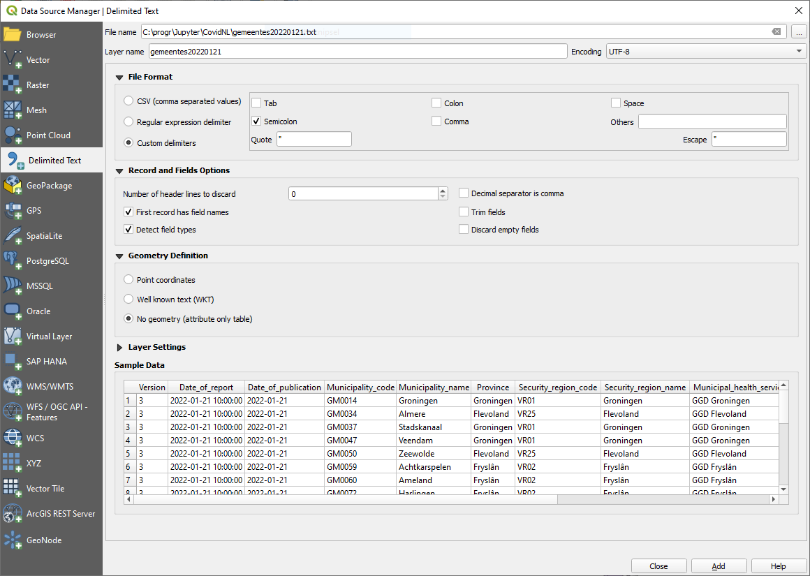
I first downloaded the daily counts per municipality, the file called COVID-19_aantallen_gemeente_per_dag.csv. From this I pasted the header line and lines of the last day into a new text file, and imported this into QGIS using the Add Delimited Text Layer function:
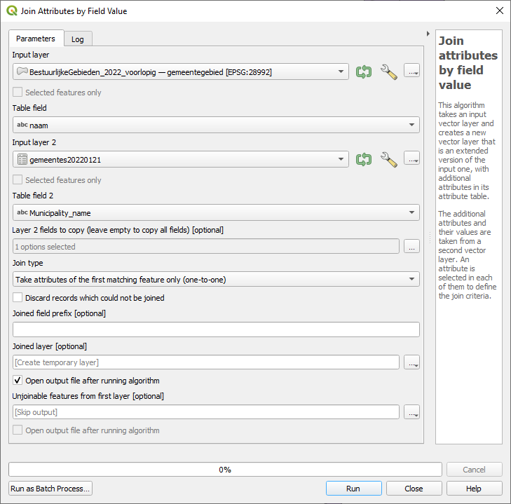
I then downloaded the current municipality borders, available on PDOK in GeoPackage format, and loaded these in QGIS. The next step is to join the two datasets together. Open the processing toolbox, and use the Join attributes by field value command that is located under Vector general. I joined the datasets using the Municipality name, but you could also use the code instead.
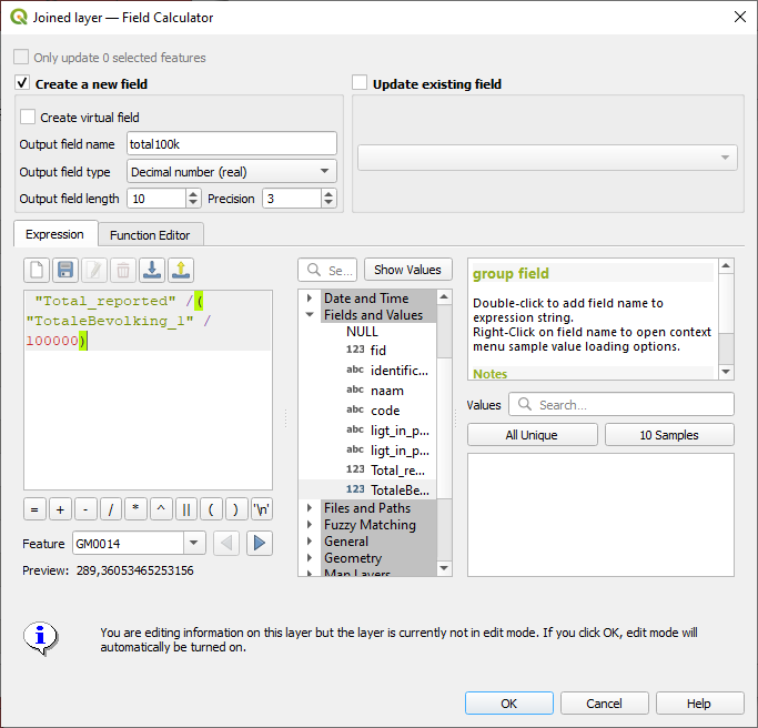
Now we’ve got absolute numbers, but it makes much more sense to use the number of cases per 100,000 inhabitants. For this we need the population numbers, which can be obtained from the CBS Open Data portal. The dataset is called Regionale kerncijfers Nederland. You can select only the most recent year, municipalities only, and only population numbers. The resulting dataset can then, after import, also be joined with the geographic data. I had to use the option “Discard records which could not be joined” to get this to work, and lost three municipalities in the process – I think that these were formed at the beginning of 2022 and hence do no exist in the 2021 CBS data.
We can then use the field calculator to compute the number of cases per 100,000 inhabitants:
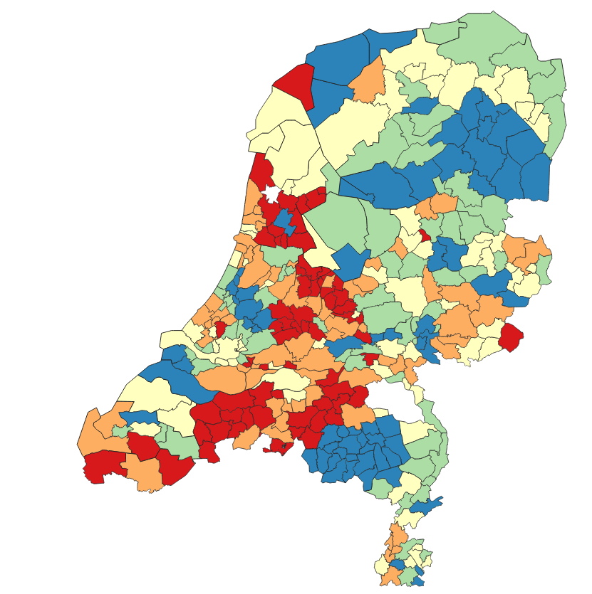
This can then be visualized as desired:
The RIVM has a map with a readable color scale, based on the weekly numbers, on its website. ESRI have a dashboard with a map based on the 7-day trend.